December 28, 2023
Creating Collateral for Comedian Dave Stone

Podcasts are the new punk rock, and listening to them while you work is pretty much universally acceptable since Covid-19. One that we listened to in the office and at home for years - before it broke our hearts by suddenly ending - was The Boogie Monster podcast, hosted by Dave Stone and Kyle Kinane (we still get our fix listening to The Stonebergs). Recently we had the opportunity to work on some promo artwork for Dave Stone's personal brand, based on an idea he had for a retro BBQ restaurant approach. Dave is an amazing cook, and hosts his own Patreon channel devoted mostly to cooking, food, stuff he's eaten recently - good, quality food is an important part of his life.
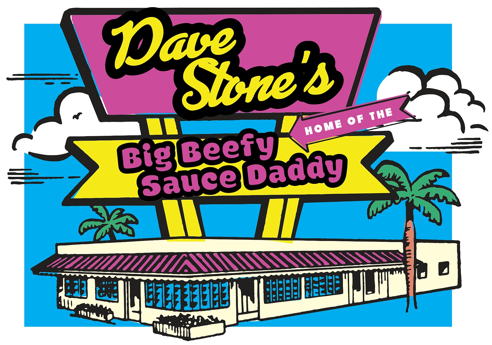
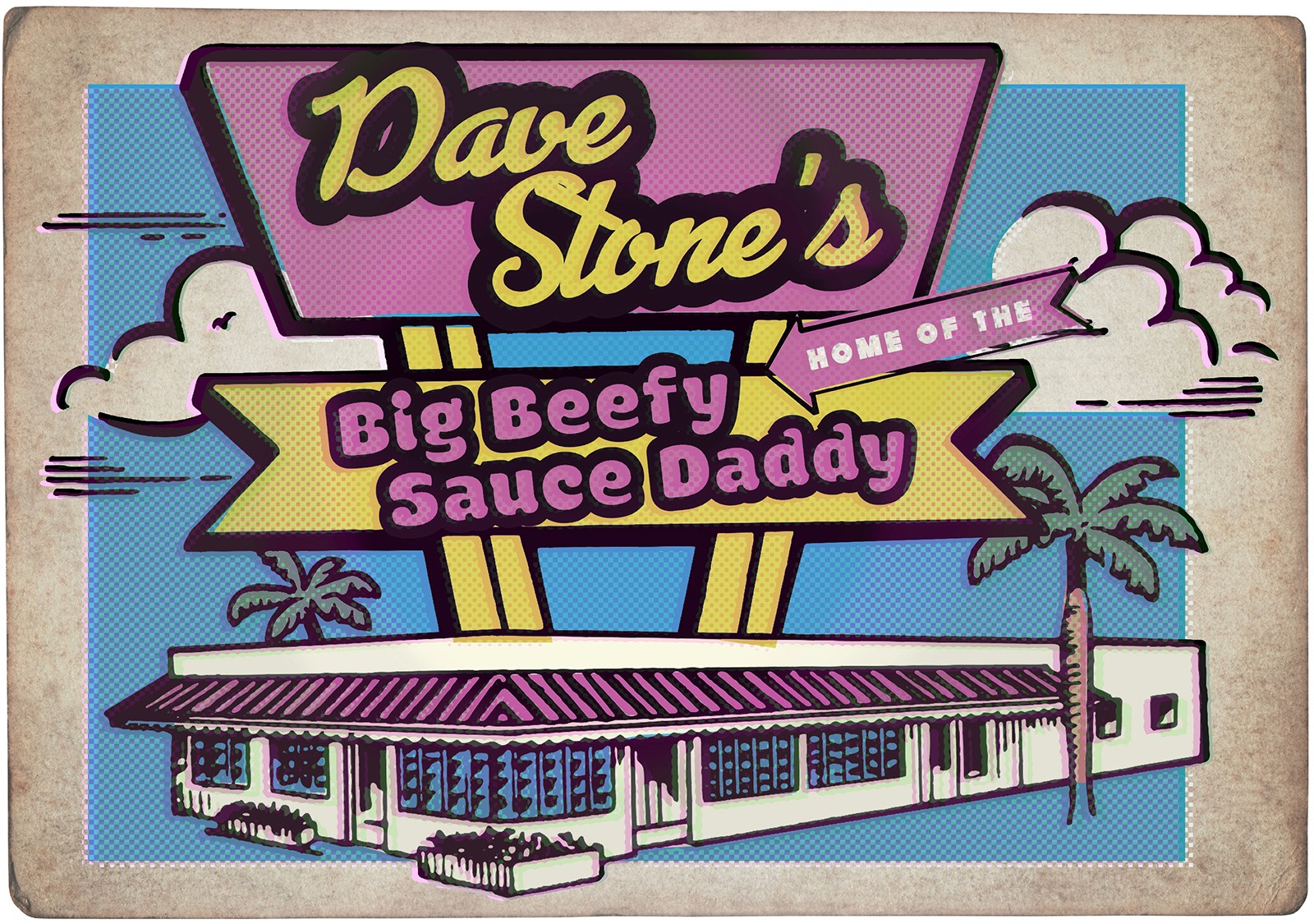
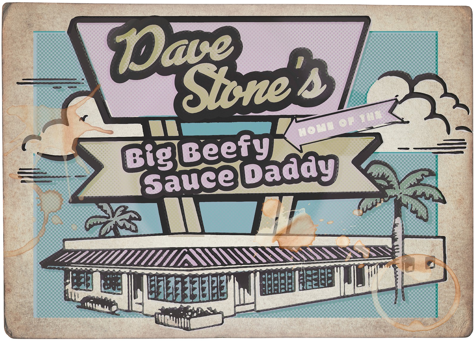
Using a mix of stock illustration, different typographic treatments in InDesign , a mid-century ish color palette that we turned up a few notches, and then weathering the final artwork to varying degrees in Photoshop, we came up with this restaurant art work that is meant to reflect the late 70's/early 80's, semi-mid century look and feel of what could be a small-town restaurant or big-city food destination. Some ambiguity there was important, after all that sign is way bigger in scale than it would be in real life, but that's the point of the artwork. This was a short, super-fun exercise that basically let us do what we want - which can sometimes make a project impossible, but was fantastic in this context.
Dave liked what we were doing, but felt it needed to look more like a mom and pop style restaurant - less large signage, more small town, quirky building, one-off type of establishment. So, we went back to an earlier piece we had started then scrapped, to see if that could be made to better reflect what Dave had in mind.

We started with this mockup of a mural, intending to incorporate it onto the side of a new, more smalll-town looking building, weathering it it to make it look old and … kind of real.

However, this approach felt a little … not tee-shirty. So, we went back to Dave's original sample graphics he'd sent, and started again from scratch. It had to look like it could be an actual tee-shirt sold in a restaurant. It also needed to be simplified down a lot - it needed to look lo-fi in its production, and like it could have been made and produced in a small town, for a small town restaurant.

That led to this much simpler graphic approach (which we put on the old looking napkin, but would also work on its own). This was getting close, but the building didn't feel restaurant-ish enough, so we went looking for another. We also weren't overly thrilled with the typography - it was fine, but not great.

That led to this building art (above), and another, different approach to the typography. This felt like it was getting better in terms of the architecture.


This led to the above, final artwork, with similar but different building, and revised typography. Once approved by Dave, we prepared files for tee shirt printing, social media, and high-res files he could use however he wanted. It works on any color background he wants, and is easy to scale up or down to suit his needs. This was definitely a wild ride through multiple proofs (this is just a sample of the variations of each we mocked up), but an amazing exercise in getting out of our own way to make something work for the client.


