May 8, 2026
New Rose Hotel's Typography
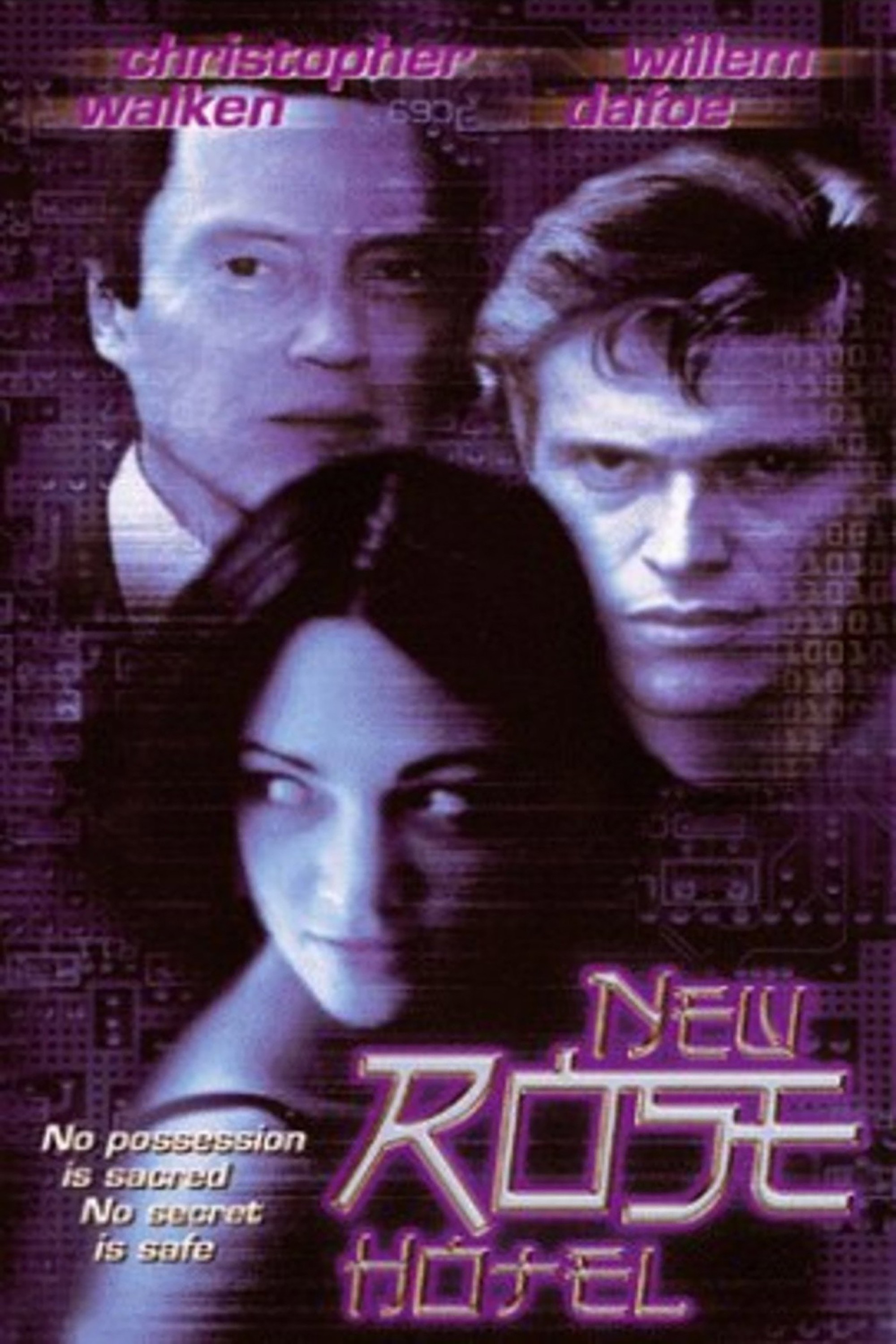
Abel Ferrara's 1998 adaptation of William Gibson's short story opens with typography that tells us not just what type of world we are entering, but, crucially, who owns it. The opening credit sequence of this film are not incidental design decisions but an orientation into a world where corporate identity has colonized aesthetics, and where alienation is the default condition of globalized life.
Alongside Ferrara, production designer Frank DeCurtis, set decorator Rich Devine, and cinematographer Ken Kelsch have been cited as contributors to the vision of New Rose Hotel's aesthetic. Unfortunately, there is no specific name mentioned in the type design. But we can look to Gibson himself, OMNI Magazine which he published in, Ferrara’s life growing up in 1990’s New York, and Cyberpunk literature's relationship to typography and code to see the design influences.
The Man Who Wrote the Future (and the Magazine That Printed It)
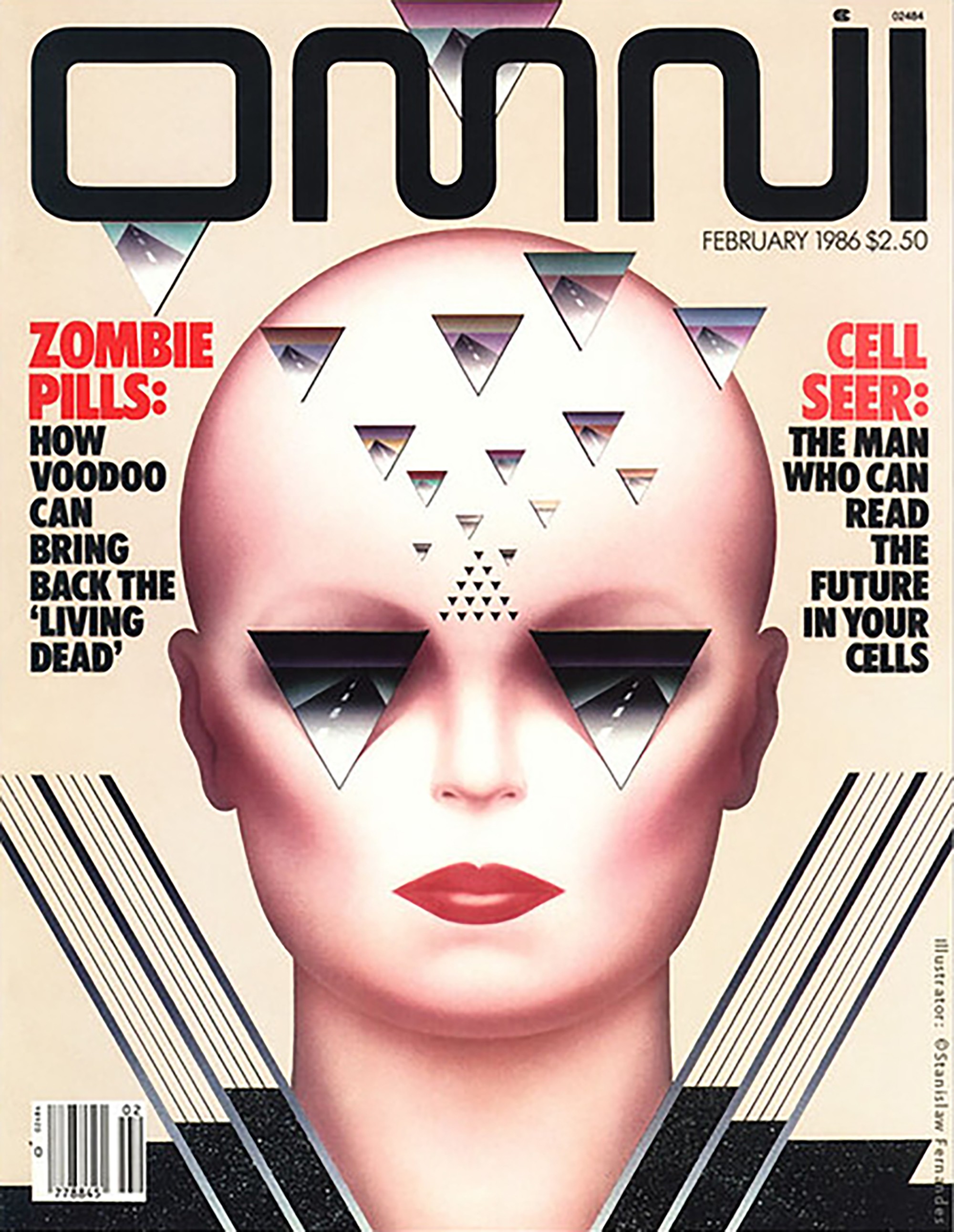
William Gibson is the Canadian-American writer who effectively invented cyberpunk, having coined "cyberspace" in his 1984 debut novel Neuromancer before most people had touched a personal computer. His fiction imagined globalized capitalism, corporate surveillance, and digital alienation with an accuracy that felt less like prophecy than journalism. OMNI was the glossy science-and-culture magazine that published Gibson's early short fiction, including the original New Rose Hotel story. With its sleek, future-forward design and compressed masthead typography, OMNI was cyberpunk's most natural editorial home.
A Filmmaker Shaped by the City
A filmmaker's relationship to typography is always revealing, because titles are the one moment when cinema makes its visual argument in pure graphic form, unmediated by performance or narrative.
Across Ferrara's filmography, a consistent typographic style across his works: blunt, sans-serif type that communicates no-nonsense seriousness. No flourish, no ornamentation. Makes sense for a guy who consistently explores gripping, dangerous noir themes. The letterforms on a Ferrara poster are not there to charm but to assert. This reflects how he is a filmmaker of unadorned confrontation. His projects show his interest in characters pushed to extremes, in cities that grind people down, and in morally-challenging worlds with no comfortable exits.
That sensibility was shaped decisively by New York. Ferrara grew up in the Bronx and came of age as a filmmaker in the New York of the 1970s and '80s - a city then defined by decay, danger, and a peculiar, gritty visual culture that would come to define American urban aesthetics for a generation. The signage of that New York was bold, functional, impatient - there was no money or time for elegance or misunderstanding. Blunt, block letters are a staple across how Ferrara themes and how his films announce themselves.
The 1990s Digital Design Moment
With a boom in production tools in the 1990’s, Neon and glow effects, metallic surfaces, and high-contrast color-against-dark-ground were the other dominant visual signatures of the era's tech-advancement font design. These effects were technically feasible for the first time in digital production, and act as the decade’s culturally legible markers of technological sophistication. The movie’s various posters play with these new means of expression, highlighting multiple themes and moods the story touches on. But the opening credits effects are no-nonsense. They're muted, controlled, almost bureaucratic, (similar to how human beings must navigate their unforgiving industrialized world). Rather than a neon explosion and high-tech gadgets commonly seen in cyberpunk worlds, Ferrara sets us up for a story highlighting the cold functionalism of a corporate monolith and humans mentally navigating this bleak terrain.
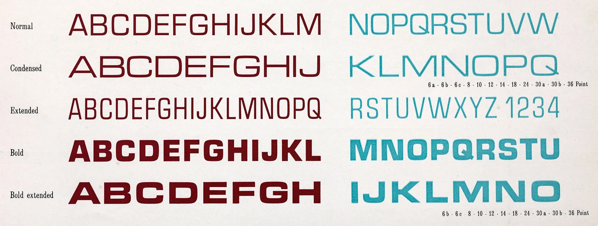
The Typeface: Microgramma's Legacy
In 1952, Novarese and Alessandro Butti designed Microgramma for the Nebiolo Type Foundry in Turin. It was a sans-serif built for technical illustrations — clean, geometric, unemotional.By the 1960s and '70s it had found a natural home in science fiction films and television, its cool authority making it synonymous with the future-as-imagined-by-engineers. Alien used it. Star Trek used it. Even NASCAR and RedBull used evolutions of it. When you want something to feel fast, futuristic, and technically dominant, you reach for this family of type.
Ferrara reached for it too, invoking science-fiction history with impersonal precision for a film exploring humanity in a world removed from handcraft and human warmth.
Oblique Form: Speed, Danger, Emphasis
The slanted oblique preserves the mechanical quality of the original while adding directional energy. In the context of New Rose Hotel's credits, that lean does specific work. It implies forward motion: the cutting edge future, a fast transaction, mind games and secrets moving too quickly to be fully understood. In a film about corporate espionage, where speed of information is literally power and the protagonists are always already behind events they set in motion, this is not an incidental choice. The oblique axis of the type suggests a world perpetually in motion, perpetually tilting toward some outcome that has not yet arrived but is already inevitable. It is the typographic equivalent of the film's central anxiety: it’s imperative you stay ahead of the game.
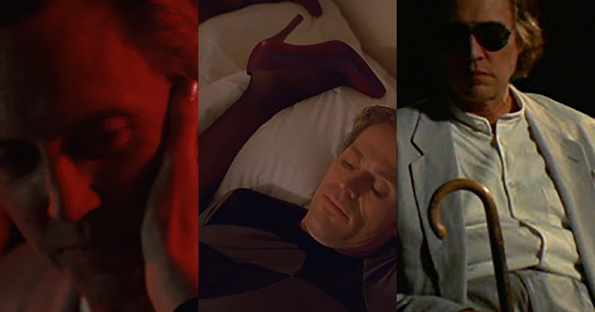
Darkness, Weight, and Neo-Noir
If there is one thing that film noir loves, it is shadow - and the opening credits of New Rose Hotel are constructed almost entirely of darkness. Names fade in from what feels like a place to be safely concealed until they’re ready to strike. And when they disappear, it is sudden and unforgiving. The weight of the typeface compounds this effect. A bold, heavy letterform carries gravitational force - it arrests the eye and refuses to be ignored. It communicates that the actions of characters are carefully, silently calculated before executed with unwavering precision and resoluteness.
Tracking, Spacing, and the Visuals of Trust
Decreased tracking can signal density of information, higher speed of processing, and machine efficiency, fitting for a time of digital evolution. When looking back at retro-futuristic types as seen in sources like OMNI, a lot of sci-fi types are condensed. This brings to mind wires carrying transmissions at high speeds, a reliance on the interconnectedness of cyborg omniscience, a flow that is scannable and trustworthy... The space between letters in NEW ROSE credits, and the sharp, clear-cut independence between letters, produces an interesting effect: we are encouraged to intake information quickly but the sharp cut of the type makes the audience re-read the text, scrutinize how well we can truly trust it, and then put our guard up. Each letter is a pillar carrying only itself, and seems on-edge itself. We can see the distinction between them urging audiences to slow down, to see the carefully painted caution - but stay ahead of your enemy! It encourages machine-like legibility but also a controlled coolness. Corporate communication that has been optimized for human reading while maintaining its air of technical authority.
The Slightly Embossed Metal Surface
The faint three-dimensionality of the credits - the suggestion of a steel-brushed, slightly embossed surface - looks laser-cut from a gun. Metal implies industry, durability, impersonality, and cut-throat precision. It is not a material associated with human warmth or organic process; it is the material of infrastructure, of the corporate world's physical plant, and of the technologies and weapons that underpin the global economy the film tracks. An embossed letterform also suggests officiality - the stamp of authority, the corporate seal, the document that has been formally validated by an institution larger than any individual… The texture asserts an enemy that is impenetrable and unyielding. It points to the monolithic structure of corporations and the distrust individuals must carry to survive within them.
To read those letterforms is to encounter the intersection of three distinct traditions: Gibson's retrofuturism, which gave us the visual vocabulary of a corporate future from the vantage of the industrial past; Ferrara's neo-noir sensibility, which borrowed cyberpunk's surface to deliver noir's emotional devastation; and the specific typographic moment of 1998, when digital design was producing a visual language of technical authority that had not yet decided whether it was in service of liberation or control.
The broader lesson here exceeds any single film. Typography is never innocent - not in cinema, not in corporate branding, not in the science fiction imaginary that has shaped how successive generations picture the future. The letterforms we choose, or that are chosen for us, carry accumulated history, genre memory, and ideological implication. When we read the credits of New Rose Hotel, we are reading a document that knows this. The type is doing what good design always does: condensing a worldview into form, making an argument without stating it, and trusting that someone will read it closely enough to understand what has been said.

June 23, 2026